I am what I would call a "periodic artist." That is, I only periodically get the urge to build, paint, draw, or mess about with Sculpey. When I do have some inspiration that hits me just the right way, then I do have to go make it almost immediately. A few years back, I had a visual cue (from a paper towel dispenser of all things) that lead me to make a series of small Sculpey robot characters. This is just a small recap of one of these creations.
Grunt, as I call him, started out as a pencil doodle. My first design in this series of figures wound up being only about an inch and a half in height, and I knew that Grunt was going to be bigger. An intermediary robot was larger than the first, but being made almost entirely of Sculpey, was very heavy. I wanted to make this one out of something that would be easily manipulated, lighter weight, and paintable. So, I settled on scraps of two-by-four pine and wood filler as my major components. Basically, I took two sections of square-cut wood and glued and screwed them together, filling in the gaps with wood filler, and laying a generous coating of the filler over the surface.
Some sanding and scoring later, I had a pretty good start. My drawing included some buck-teeth, but they didn't seem to work once translated into a three-dimensional object, so I didn't press my luck adding them in.
You can see the variegated coloring of the wood filler here. Dried and sanded with fine-grit steel wool, it is quite smooth.
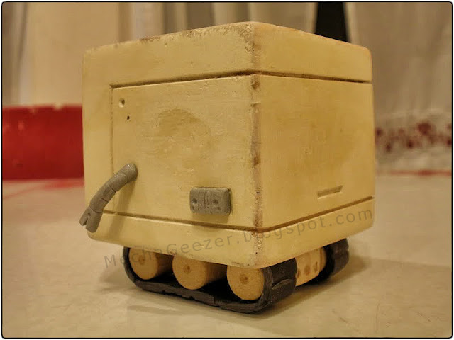
I added another smaller block of wood, some cut dowel lengths, and a variety of Sculpey additions to the blocky body to make the final, unpainted character.
The panel scoring goes all the way around the body. I added some rear vents in the body and the undercarriage.
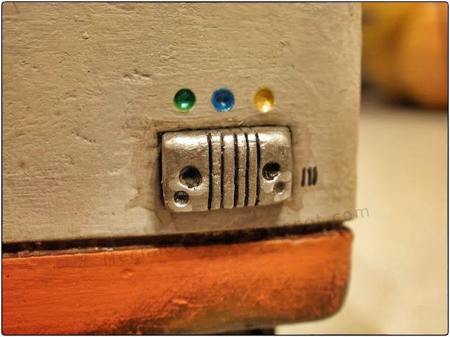
A small "console" of sorts sits on Grunt's side.
Here you see my relatively clumsy way of attaching the undercarriage. It has the advantage, however, of being removable if needed, and more easily allowed for the wrap-around Sculpey treads to be attached to the dowel bits.
When painting my creations, I use a variety of techniques including some washes and dry-brushing. I settled on an orange and white color scheme that seemed fairly in keeping with the utilitarian nature that I had imagined for Grunt.
He has a look that says he's both well-meaning, but also self-satisfied.
I tried to make it appear that Grunt has been hard at work, and has had little time for a bath.
I added a few small colored pits in the surface above the console, and gave it a nice shiny coating of silver.
Here you can see the rear vents painted up to represent staining from exhaust fumes.
Grunt is not entirely symmetrical, as he has no console on this side.
The top also sports some panel lines and the two-tone coloration.
This view shows off the top surface a bit better.
Hopefully, I'll do some pictorial reviews of my other figures in the series, but Grunt is really the only one that I photographed during the process of creation. I'm pretty proud of Grunt. He manages to represent my original drawing faithfully, and I am pleased with how the paint job came out. Each of these characters has its own unique personality (at least in my mind), and Grunt is sort of an ignorance-is-bliss kind of guy - always cheerful and ready to do a hard job for someone in need. I like cute little characters, and who doesn't love someone who seems so happy all the time? Go, go, Grunt!


I think the rear vent staining was a brilliant touch. He is a fine specimen, Sir.
ReplyDeleteI am so impressed by the amount of skill and level of detail you put into your work. You may not believe me, but your sculpture has always been an inspiration to me. Your work is amazing. I look at this last bit: a box and a few bits of detail, and it LOOKS happy. This guy shows more emotion than anyone should expect from a few little holes. With only a few lines, you've captured an emotion perfectly.
ReplyDeleteThanks! I'm very pleased with how he turned out. :)
DeleteLove the colors...very Super Ostrich!
ReplyDelete